Wednesday, July 17, 2013

OFUK: WWBVD?

While I patiently, or not so patiently, wait for my new light fixture I am beginning to eye up the next step in my kitchen redo: the molding. However, I feel a bit befuddled as to what I should do with it. Should I keep it and paint it or should I dump it and install some taller molding? So I ask myself: What would Bob Vila do? He would probably say keep the wood, but since I don't even think it is really all wood and it is in poor shape he might actually be disgusted.

So let's play a little game called "Reasons to Keep and Paint and Reasons to Chuck and Buy New" (this has been copyrighted so please ask permission before using this title for a different game).

Keep:
Cheaper
Possibly easier...only priming and painting

New:
More attractive, taller molding
Last longer
No priming
Match new molding around cabinets


Hmmm.... I wonder if I am biased? What would you do?

This is the current molding; the white will be the future color of all the molding. (So far all that I have painted is the door casing and molding around our new French door, which is what you see).


Then the questions is: if I rip out all my molding, doesn't it make sense to just use this opportunity to replace the flooring too? Don't tell my husband. 


Monday, July 15, 2013

OFUK: Lighting

Currently, our kitchen sports a reasonably nice set of matching light fixtures: a chandelier over the dining table and a downward facing open light in the kitchen area. However, they seem like they were put in by the builders...builder standard just like our cabinets. I want anything BUT builder standard for my new kitchen. I want moments of awesomeness all over my kitchen. So I am on the hunt for unique and affordable lighting.

I started at my local Lowes store, because - let's face it - they are pretty great at providing a plethora of options. Fortunately, it didn't take me long to spot a style I liked because of course within moments of arriving some undesirable smell was emanating from my squirming 1 year old and I was without a diaper bag.

These are my inspiration pieces:


Allen Roth Edison from Lowes
Allen Roth Edison Mission from Lowes


Next, I turned to the Internet to find more ideas on mixing and matching. I do not want a matching set, rather, I'm seeking pieces that enhance each other. I found this photo and loved it:

What is great about these fixtures is how harmoniously they work together even though they aren't technically the same style. They have a couple common elements that allow them to play off one another. First, they are all round in some manner. Second, they all have a black element, either the metal or woven into the fabric. And third, their sizes vary, so none seem to dominate the other. (This picture comes from: http://www.bobvila.com/light-and-style/27591-trending-now-pendant-lighting/slideshows)

From here I have spent countless spare moments searching and pinning possibilities until I kept going back to the same fixtures. Unfortunately, the one I REALLY wanted for above my dining table won't work because it is a flush mount and my ceiling is at an angle...all the pendants would bang against each other in an unpleasant way.

 I adore the charm of mason jars. Sadly, this chandelier needs to be mounted flush with the ceiling.


My search brought me to West Elm (need I say more). I discovered these gorgeous organic blown glass pendants. PERFECT! This has that cage appearance with the simple elegance of clear glass. Beautiful but understated.


 This is another fixture from West Elm that reminded me of my inspiration picture. Again, the simplicity lends it elegance. I could see this over my table and the blown glass in my kitchen.


 Although I liked the previous pairing, I still like to see all my options. I came across this fixture at Pottery Barn. This cluster would allow me to have the mason jar look but it would still hang crookedly.


Finally, this beauty popped up on my screen (inmod) and I knew I was in love. The woven wood would play up the baskets I have in my open shelving and provide the warmth only wood can provide...which will soon be lacking once I paint all my molding. However, it is a statement piece. Having it over my dining table would mean that the light in my kitchen needs to be more simple, meaning no organic blown glass in the kitchen (maybe in a different room).

Instead, I will go with the simple yet charming Edison pendant from Lowes.


These are my current fixtures. They are nice, but they don't really fit our style or my vision of my dream kitchen. The new fixtures will be quite the upgrade! I can't wait to get them installed!


Saturday, July 13, 2013

The Kitchen and the Beginning of De-Oaking!


I am beginning to believe I have a serious case of decorating ADD. Looking around my house, you can see room after room with an idea in mind of what the room was supposed to look like, but was halted prior to actually being actualized. Case in point: my "new" nursery. After spending countless hours creating a beautiful argyle wall I never really finished putting the rest of the room together.

Well, now that I am beginning a new chapter in my life as a stay-at-home mom, I think I am going to make a conscious effort to complete what I begin: starting with the kitchen.

Since we moved into our house 7 short years ago, our kitchen has been 4 different colors. Now you might be thinking that we either REALLY love to paint or...we hate our kitchen. The latter would be correct. It was far from my dream kitchen. Being public servants, actually I guess now one public servant and one family servant, we don't exactly have the cash flow to create my dream kitchen. But this minor detail will not stop me from at least trying to obtain a bit of the dream.

The week after the final week of the school year I began Operation Frugal Updated Kitchen or OFUK.
This was the second color (red). We liked it but decided to neutralize to try and sell our house.


The above red color is the second color we painted the kitchen. When we moved in it was white and blue. Then we painted it a yellow color, which was hideous with the "oak" cabinets. I never took a picture of the yellow because it didn't last a week. We liked the red but when we decided to put our house on the market, we thought people might think it a little strong. So below you can see the current color, which is one of the few colors that seemed to not look hideous with our honey oak molding (and which you can find in our hallway, nursery, bathrooms, and master bedroom).

Current color and before OFUK. 

 So the first step of OFUK was painting the cabinets: 4 weeks later or 4 bottles of wine later:


The color is called Bedford Gray from Martha Stewart, sold by Home Depot.  It is hard to tell from these photos but the color is a warm gray-tan, which actually works perfectly with our latte walls and less-than-favorite green-gray counters.

(I wish I could say my house in normally very clean; however, this is the state of my kitchen on a daily basis.)

Miraculously, there was no sanding involved. I just used a gripper primer and two coats of paint. The most difficult part of the process was waiting between coats to avoid any tackiness. I also was pleasantly surprised that I could avoid all paint brush marks by using a high density foam roller.

The Process:

  • Remove doors, hinges, handles, and drawers. 
  • Wipe them down to remove dirt, grime, and grease
  • Prime
  • Paint two coats
  • Put back together! 


Because I have a 1 year old and a four year old who like to get into everything. I did my kitchen in sections after bed time to allow for at least 9 hours drying time before put to the test by little fingers.

To give the kitchen  more of a custom look, I bribed my husband into turning the cabinet to the right of the sink into open shelving by hacking away the middle piece and adding decorative molding. I also had my husband attach bead-board to the breakfast bar so it didn't appear too plain. And lastly, I painted chalkboard paint next to my growth ruler. That way I can make notes when I take the boys' growth pictures.

The NEXT step of OFUk will be the molding and lighting...stay tuned!

Sunday, July 7, 2013

The Nursery in the Making

When I first discovered I was having another boy, truth-be-told I was a little disappointed. NOT because I was having a boy (I LOVE having two boys!), but because I wanted to finally create one super girly space in my house.  Being the only girl in the house, it would be pretty great if I could have one space just be all girl. I was utterly confused as to how I could go about creating a really cool space for another boy, especially since the typical boy-related decor doesn't really fit me or my family (we are not big into sports, cars, or the stereotypical boy stuff). But after conducting a little "research" on the Internet I came across this blog of a nursery inspired by argyle scrapbook paper. Instantly, I knew that was what I was going to do. (Plain Jane Boutique Blog)

I would have to say when painting an argyle wall the beginning steps are the most important and the most tedious. First, decide how big you want your diamonds. This will dictate how many rows and columns you will have. I actually ended up using this really handy tool that calculated the number of rows and columns and therefore the size of the diamonds based on the proportion of my wall (unfortunately the site is now down). I ended up with 10 columns and 4 rows (23 inches tall by 12 inches wide). Then I drew 10 vertical lines and 4 horizontal lines using a tape measure and level. (It is difficult to see in this picture, but the lines are there.)


I then mapped out the color pattern on my computer simply using a Word document. I wanted something random with pops of color. To save money I bought Valspar samples, two of each color (and I actually have a lot to spare...possibly to use on other projects). It is somewhat difficult to see in the photo, but the colors I chose were a dark brown (it looks black in this photo), light and dark blue, a sage green and pumpkin orange. The dark brown I used to repaint the below dresser. 

This is with all the colors finally done. You can see my little helper. 


A smaller side-project I began along the way was painting my Grandmother's old dresser. You might also notice from the previous picture to this one: we finally tore out and replaced the aqua carpeting (the previous owners allowed their three year old to pick the color...not something I would have chosen).


The final step of painting the wall was adding the cross-hatching. My husband helped me tape it out. I again wanted it slightly imperfect (something that drove my husband to swearing fits). So the lines are not all the same width, and they aren't really the same distance apart. I like it a little organic. Plus with the really rough surface on the wall I knew I wouldn't have completely clean lines. So this is the completed wall. I LOVE it! I don't know if this is the best or easiest method of painting argyle, but it worked for me with a very textured wall...I was also able to do it over the course of a couple months while very pregnant, working full-time, and with a toddler...So if I can do it, I am sure anyone could do it and probably have an easier time!


I am happy to present the "almost-finished" nursery...the baby came before I had energy to complete the last bit of decorating and I haven't really had a chance to complete it since. However, now that I am done working I hope to finally complete it!


Almost finished! 
Modge Podge Name

Tuesday, April 3, 2012

Absence

And this is exactly why my life would benefit with at least a road atlas if not a competent GPS. This last year my family has been one of the toughest yet most wonderful years yet. Last year we had our house on the market in an effort to proactive when we received word that my husband would be laid off from his job. As summer continued and nothing was happening the stress of the house and the lack of income weighed heavily on our shoulders. 

However, in late July my husband was offered a wonderful full-time position as a middle-school social studies teacher. Needless to say we were ecstatic. So ecstatic we decided we didn't want to wait any longer to expand our family and we found out we were expecting our second child the month of August. 

This second pregnancy proved more difficult than the first. I was sick for the first 4-5 months, which explains my inability to post. After working all day I barely had the stamina to stay awake until my two year old went to bed at 7:30. In addition to working my school switched to a different schedule, which meant rewriting much of my curriculum and reformatting my lessons.

Being the first year in a new district and a new class, my husband had it even rougher by having to learn brand new curriculum and write completely new units. Needless to say our school year was rough. 

Luckily we did have our son to look forward to meeting, which we didn't have to wait as long as we thought. Harlan Theodore came 2 weeks early. Apparently as eager to meet his mama, papa, and big brother as we were to meet him. Now I am looking forward to almost 6 months on not working and instead enjoying my family. And of course I am happy to be returning to my blog. I have been very busy around the house. My bedroom has been a continuing work in progress. And of course Harlan's nursery has been my main decorating project, which I will plan as my next post. 

I guess upon reflection, we navigated this past year fairly well without a map. Maybe if we had one, we wouldn't have had Harlan and that I just can't imagine. 

Tuesday, July 19, 2011

I Love You, I Love You Not

So it happened again, just as I begin imagining myself living in my house and getting excited about the decorating possibilities another relator called for a showing, and just like that I have to move myself back out of the house in my mind. We have had our house up for sale for the last year. After my husband received his third layoff notice in the last three years, but was eventually just reduced to part-time, we decided that we just can't put ourselves in the position of financial crisis and potentially hurt our family, so we decided to sell our house. In order to be okay with this decision and not have an emotional melt down I began creating a mental list of all of the things I disliked about our house. I soon fell out of love with our house. I love you not.

We stopped talking about home improvement projects and decorating projects and focused instead on the house that we would love to have in the future. One month ran into two and then six months went by without any serious interest. Winter came and I have a tendency to start to get the itch to redecorate and nest around February and March. I thought, maybe the reason why we haven't sold is our paint colors. So I poured over decorating blogs and websites for ideas to neutralize some rooms but still keep some personality and slowly I began falling back in love with my house. I LOVE YOU!

 However, with the end of April we received yet another layoff notice, which would be final. Since our house is not a one-income house my love turned to instant loathing (for my house). I vowed that the house would not drag my family down. We dropped our price and became very serious with selling again. I love you NOT.

And then July came and my wonderful, talented husband was offered a new full-time position. Since there hasn't been much interest in our house, I began looking around the rooms and visualizing projects: a bright and shiny laundry/craft room, a lighter more family-friendly family room, painted white trim and kitchen cabinets…oh all of the possibilities. I love you!

Then today yet another call from a relator and once again I have to put aside all of my plans and distance myself from my house. I don't know of a place I hate more than limbo, which has become my house. I SO do not love you.

Tuesday, March 29, 2011

Truman's Art Gets New Life

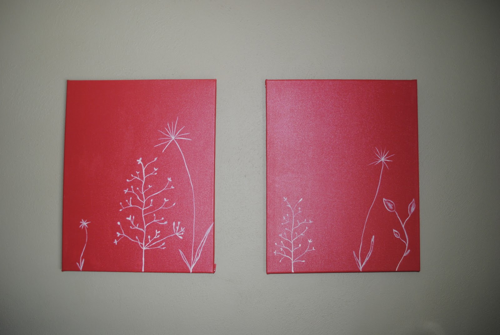
When I decorated my son's nursery I added a personal touch. I took two canvases and painted them the color from our kitchen. Then I painted a design inspired by one of his baby blankets. 


Now that he is a little older he has developed a passion for numbers, letters, and the color orange. So I thought I would update the paintings to reflect his current passions. In order to save on money and to make sure the art would fit into his room's color scheme I used the cream I used on his upper wall and ceiling and the brown was left-over paint from the brown stripe near the ceiling. The orange paint came from our guest bedroom. (Yes, I have an orange wall in our guest bedroom.) The only item I had to buy for this project were the stencils. Since I am not a very patient person, I didn't want to go through the painstaking slow process of drawing lines and making sure the letters and numbers lined up perfectly, which is why the numbers are floating and the letters are a little off kilter too. I actually think they look better not perfect. 


I wanted the orange to be present, but I did not want it to be "in your face." So I just picked random numbers to paint orange; however, the letters I chose more discriminately. The orange letters are actually all of the letters used to spell my son's name TRUMAN. I was at first a little worried that it wouldn't look good unless there was more of a pattern, but I like that it has meaning and we can point out the letters to him as he starts to understand them a little more.